HBSC International
Brand Identity
For over 40 years HBSC has been a pioneer cross-national study gaining insight into young people’s wellbeing, health behaviours and social context. This research collaboration with the WHO Regional Office for Europe is conducted every four years and HBSC uses its findings to inform policy and practice to improve the lives of millions of young people. With research teams in over 50 countries across Europe and North America, HBSC realised the need for a comprehensive brand so that the organisation could speak with one voice.
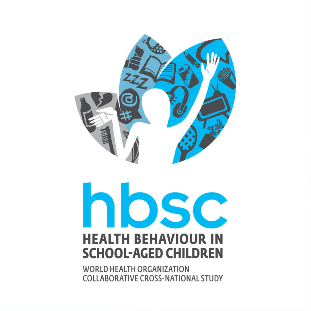
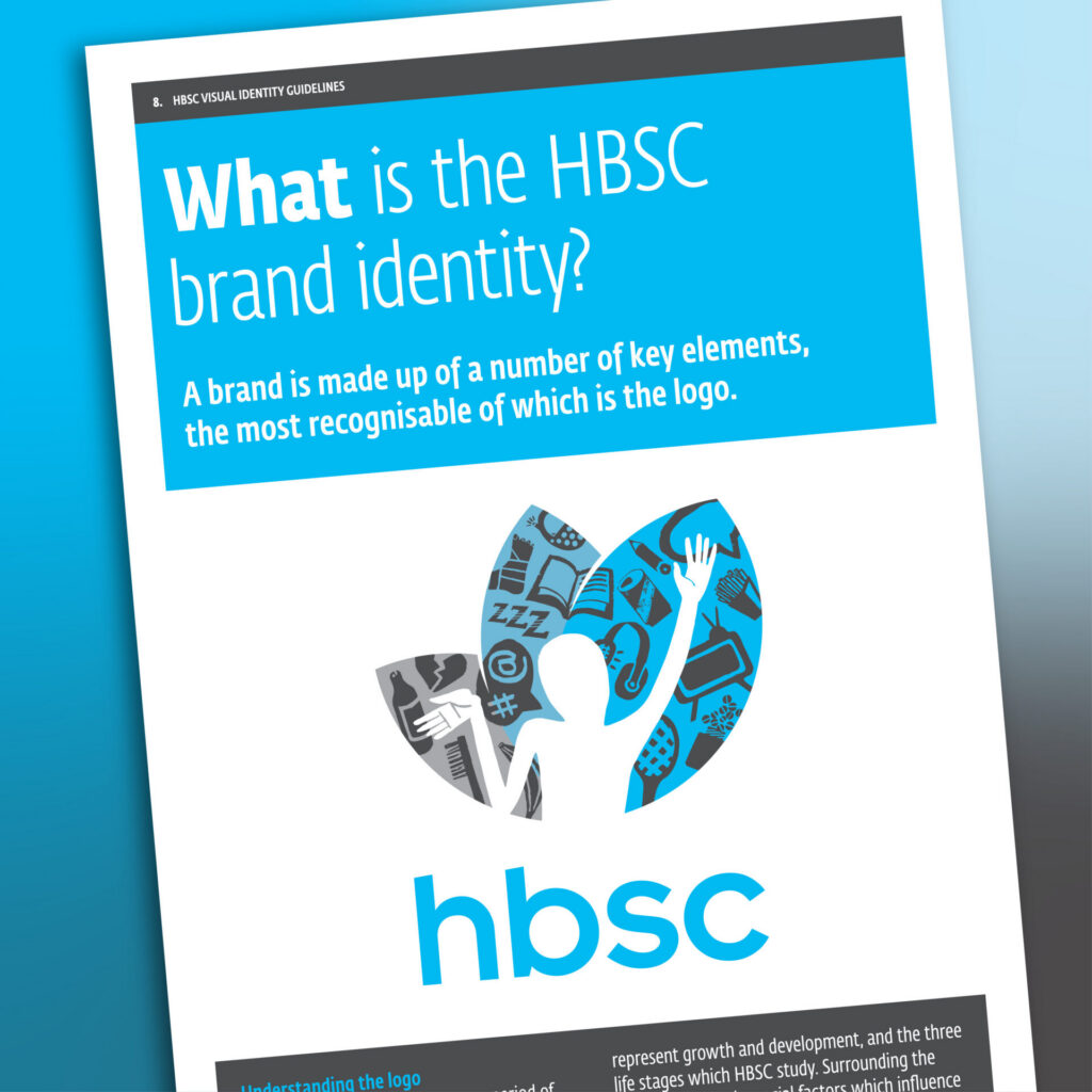
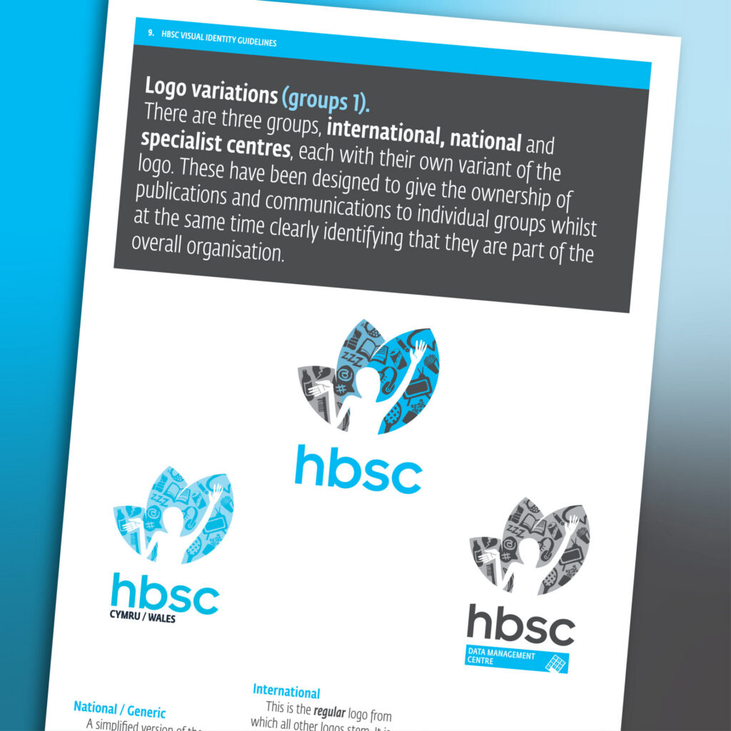
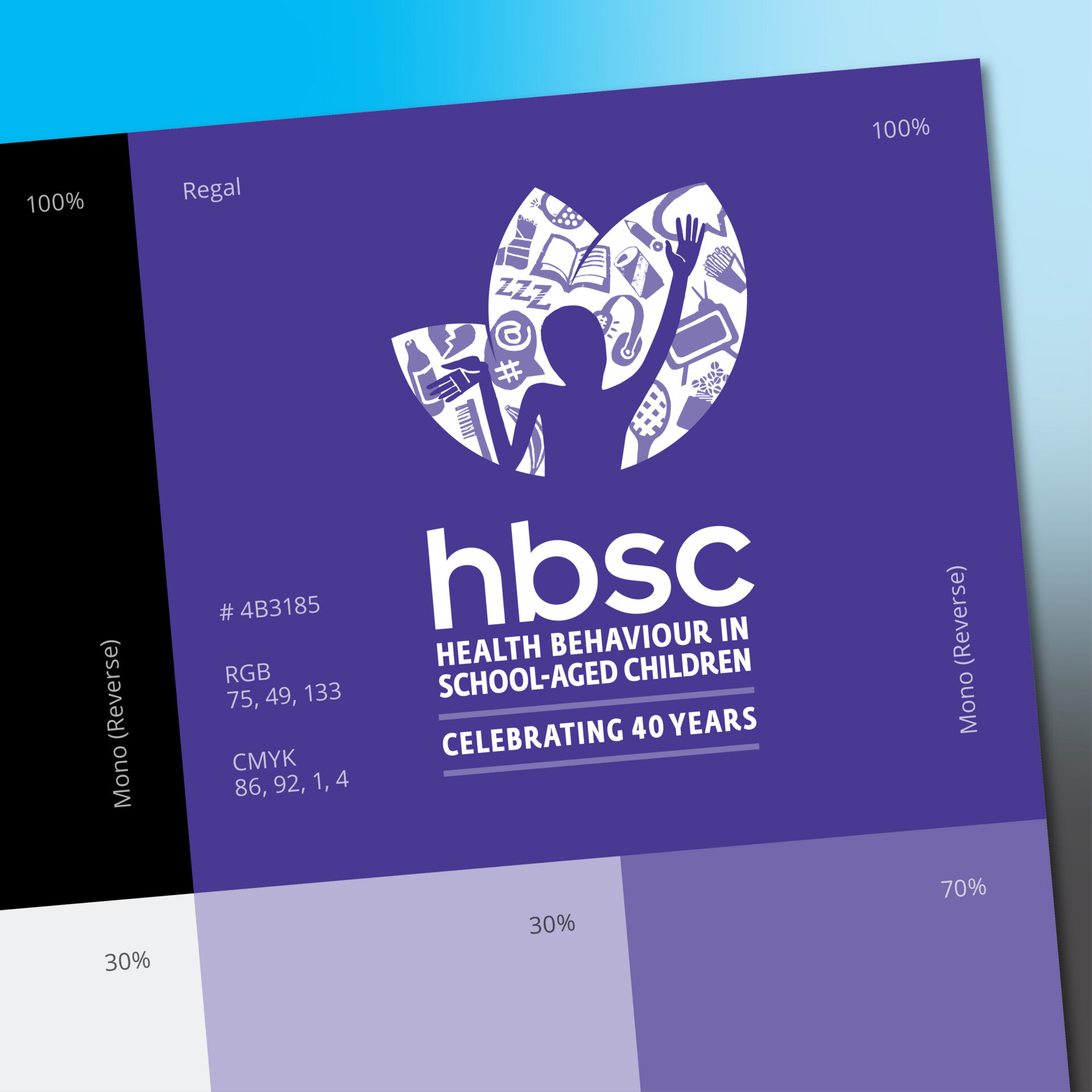
The topics covered by the study are as numerous as they are diverse and distilling this into a single entity that could represent the ethos of the organisation was a challenge. Add to that the need for it to be understood and deemed acceptable by different nationalities, many with their own language and cultural traditions. After much collaborative research we arrived at the trefoil logo you see below. It represents emotion, growth and the environment that a child experiences and inhabits on their journey to adulthood.
As well as the core logo which appears on the joint international communications, each team has been provided with a set of multi-lingual national logos and comprehensive guidelines so that they can be used at a national level.
The organisation recently celebrated it’s 40th anniversary for which a new variant of the logo was added to mark the occasion.